Ultimate Guide to styling Purple Houseplants
Style purple houseplants like a pro with tips from our Brooklyn community home—pair bold foliage with the perfect pots, rooms, and textures.

When you purchase through links on our site, we may earn an affiliate commission, which helps sustain our blog!
Who says greenery gets all the attention? In 2025, purple houseplants are stealing the spotlight in stylish homes everywhere—from moody modern nooks to eclectic boho lounges. With their lush foliage and unexpected hues, they’re the perfect blend of earthy and dramatic. According to a trend report by Garden Design, purple-leaved plants saw a 34% rise in indoor decor mentions last year!
Whether you’re drawn to rich aubergine tones or lavender accents, we’ll show you how to keep the purple foliage and make them shine. We’re styling these bold beauties in a variety of interiors—with tips, tricks, and pot picks that feel personal, lived-in, and totally fresh. Let’s turn your space into a color-loving sanctuary!
Styling purple houseplants: Matching Purple Houseplants with Modern Interiors
Styling with neutrals: how purple foliage pairs with white, gray, and matte black
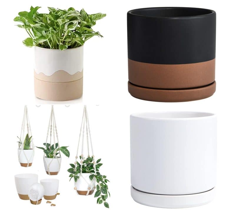
Purple pops best against neutral tones—that’s the first thing we noticed when we moved our Calathea Dottie into a white-walled space. The leaves immediately felt more vivid, more intentional. Matte black shelves and soft gray walls also work beautifully with deep purple foliage. We avoid overly colorful backdrops since they tend to clash. White pots(~$9) with crisp lines or black planters(~$10) with texture let the purple do the talking.
Using symmetry, clean lines, and minimalism to enhance purple tones
In a modern space, we’ve had the most success with symmetry and clean shapes. A pair of Purple Heart plants flanking a mirror or bookshelf gives structure, while the color adds warmth. Too many different textures or plant shapes can make the purple feel chaotic. Keeping things balanced and minimal lets those saturated tones actually feel intentional, not like an afterthought.
Best pots: concrete, ceramic, geometric planters
Our go-to planters for styling purple plants? Concrete, matte ceramic, or anything geometric. Concrete planters give that raw, sculptural feel that contrasts beautifully with the softness of foliage. Geometric pots—especially faceted or angled ones—look fantastic with rounder plants like Peperomia. Bonus: they usually come in neutrals or muted tones that don’t compete with the plant.
Where to place: entryways, shelves, modern office desk
Some of our favorite spots for styling purple plants are entryway consoles (hello, first impressions), open shelving units, and desks with clean lines. A single purple plant on a white office desk adds just enough personality without clutter. We also love placing a tall Guzmania or Calathea in an entryway to pull the eye without needing art or accessories.
Pot & Planter Ideas for Purple houseplants
Best materials: terracotta, clay, brass, reclaimed wood, and concrete
We’re huge fans of concrete and clay for that earthy-modern mix—especially with a plant like Purple Passion. Terracotta(~$16) gives warmth and texture, especially if you lean boho or natural. For moodier or more glam spaces, brass pots steal the show. We even use reclaimed wood boxes for Fittonias in terrariums. Each material brings out different tones in the purple foliage.
Choosing colors: soft pastels, rich earth tones, or monochrome palettes
Color choice matters more than we expected. If we want the plant to be the focus, we go with white, black, or gray. But sometimes, pairing a deep purple plant with a dusty pink or rich terracotta pot creates this gorgeous warm balance. We usually skip bold or glossy colors—those tend to fight with the foliage instead of framing it.
Planters that reflect each design style—boho vs. modern
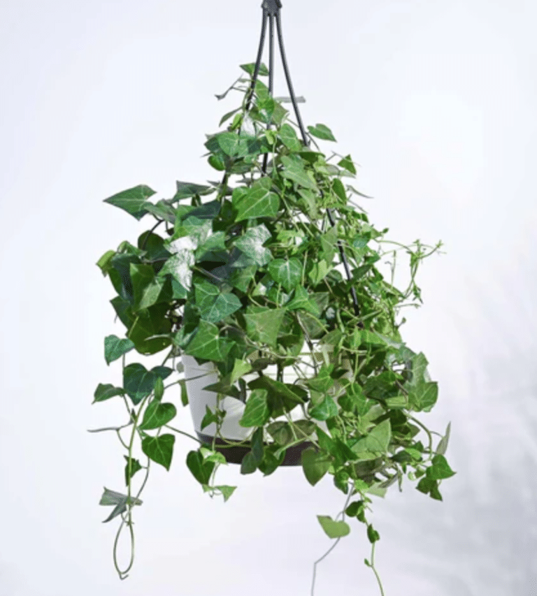
For a boho vibe, we go with hanging baskets with macrame hanger($~8), terracotta, or handmade pottery—something with texture and personality. But for modern styling, it’s all about matte finishes, angular shapes, and clean lines. We actually keep a little stash of pots in both styles so we can switch things up when a room’s energy changes.
DIY planter ideas for a personalized touch
Some of our favorite planters have been DIY projects—painted concrete bowls, upcycled tin cans, or even wrapping simple terracotta pots with jute or linen. One time we wrapped a small orchid pot with leftover velvet ribbon and—no joke—it looked like something from a designer store. These little customizations help the pot reflect both the plant and your space.
Lighting & Placement Tips for Maximum Impact
Using natural vs. artificial light to deepen purple tones
Natural light is your best friend if you want to keep those purple tones deep and saturated. East- or west-facing windows work great for most varieties, giving that balance of brightness without scorching. But when light’s limited, we’ve had success using grow lights(~$17), especially the full-spectrum ones.
Read also: How much light to keep the purple foliage?
Where purple plants stand out visually: corners, focal points, open shelves
We’ve found that purple plants really shine when they’re used sparingly but strategically. A single deep-purple orchid in a clean corner reads as sculpture. We also like mixing them into open shelves with a mix of neutrals and books—it breaks up the monotony without being chaotic. They’re not filler; they’re the spotlight.
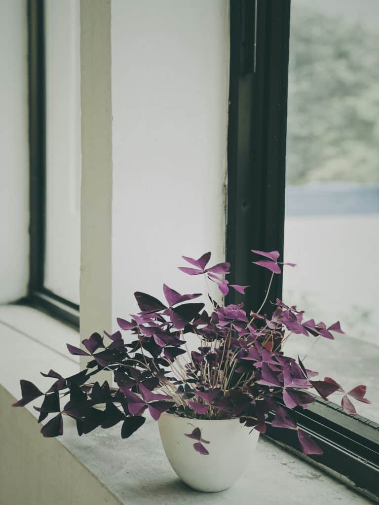
Styling near windows, against light walls, or with mirrors
We’ve had fun styling purple plants against white or pale walls—that backdrop makes the leaves glow. We’ve also placed a Calathea near a mirror once, and the reflection doubled the impact. Positioning them close to windows with sheer curtains gives soft, filtered light and a little movement as the sun shifts. It adds atmosphere, even without blooms.
Tips on rotating and grouping for a balanced look
We rotate our plants every month or two so the color stays even on all sides—otherwise, one side fades while the other thrives. And when we group plants, we mix foliage textures: a velvety purple with a glossy green or a spiky cactus. This contrast makes the purple pop even more, while keeping things from feeling cluttered.
Common Mistakes to Avoid When Styling Purple Plants
Overcrowding or clashing with bold decor
Purple plants work best when they have space to breathe—visually and physically. When in doubt, edit the surroundings. Less clutter = more impact.
Ignoring light needs that dull foliage color
Gorgeous styling doesn’t work if the plant isn’t getting what it needs. Always consider light first, then location. You can have beauty and health—you just have to plan it.
Using overly colorful pots that compete with the plant
We once paired a rich purple plant with a cobalt blue pot thinking it’d be a “fun pop.” It looked mismatched and jarring. Now we stick to neutral or earthy tones, letting the plant shine. When in doubt, we ask: would this combo calm the eye or confuse it?
Forgetting contrast or texture in minimalist designs
In one super minimalist setup, we put a purple plant in a matte white pot on a white shelf, but it looked invisible. It needed texture or contrast—something to anchor it visually. Then we added a natural wood riser(~$9) to give it depth. Minimal doesn’t have to mean invisible!
Conclusion:
Purple houseplants are more than a bold color choice—they’re a design statement that can shift the vibe of any room. Whether you’re aiming for sleek and modern or free-spirited boho, styling these plants is all about balance: color, texture, light, and intention. Play around, trust your eye, and let your plants—and personality—shine. Want even more styling ideas? Subscribe to our newsletter for fresh inspo every month!